
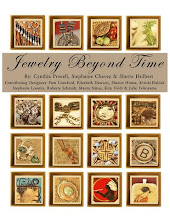
Per a request, I will attempt to write the steps I took in making my Lynne Perella-style ATCs.
I began by reviewing Lynne's 2 books and also looking at her website. I will clarify this tutorial with the note that I am an intuitive artist. In other words, I don't plan out my work first, I just go with the flow as I begin to work. Whatever strikes me as "right" as I am working is what I use and do.
MAKING THE BACKGROUND-I started the artistic process with a 12 x 16 Kilimanjaro 140# cold press watercolor block. This is a nice quality watercolor paper. I used the Paint Scraping technique that Traci Bautista describes in her book, Collage Unleashed. The paints I used were cheapy Craft Smart Acrylic paints that I got at Michael's for only 50 cents each. They had a lot of bright fun colors that I originally bought for my Funky Journal (swap in the Arttechniques group). After letting the paint dry, I then used some of the same paints and applied them to a rubber stamp and randomly stamped the page. I also stamped with a gold metallic paint, but it didn't show up real well. I then randomly sprayed the page with some of the brighter of the Color Mist sprays (from Outside the Margins). Using some assorted number stamps, I then inked the stamps with dye inks and added those in a random fashion. I had noticed on Lynne's website that she had slashes of pastels in some of her work, so I lastly added slashes of soft pastels to the page. I cut the page into ATC sized pieces and a larger piece to use as a page in my Funky Journal. There is a sample of this background piece below on my blog. Scroll down and you will see it.
MAKING THE "PASSAGES OF TIME" ATC- I printed out onto HP Premium paper some vintage images that (to me) looked like images Lynne would perhaps use. The images were from a Tuscan Rose image CD. Choosing one of the backgrounds and one of the images, I attached the image to the background using a glue stick. I have found that even if you sand the watercolor paper first, Xyron does not adhere to watercolor paper. I dribbled some yellow India Ink (Dr. Ph. Martin's) onto the image and background. With "Passages of Time" (scroll down the blog and you will see it), I used a stamp I had recently gotten from Stampers Anonymous ( an arrow design), and stamped in two different directions onto the ATC. I chose the arrow direction as going into the ATC's center. This was a deliberate design choice to lead the eye inward rather than off the edge of the ATC. I then stamped more numbers (Lynne seems to have a thing for letters and numbers). I added a butterfly half to the lower right-hand corner. I wanted to incorporate this image into the composition so I used the Color Mist Spray in Tahoe Turquoise and sprayed the butterfly and lower half of the woman's image. I then added some pastel markings in pink and green. The woman had a semi-wistful expression so I found the "inchie" of the little girl that I had left over from a previous swap and added that to the upper right-hand corner. I chose straight alignments for both the inchie and the butterfly as opposed to angling them. This was a matter of design choice. I wanted a stable rather than active look. Angling images gives a more active feel to a piece. At that point I thought I was done and posted it to my blog. When I looked at the ATC later, I noticed that the inchie looked "stuck on" and not really incorporated into the design. So I took the pink and green pastels and added them to the corner of the inchie. This brought it into the composition and I was finished. I named it "Passages of Time" because I felt that the little girl could have been the woman when she was younger, and butterflies represent a metamorphosis. Something in this woman's past changed her from the happy-go-lucky girl to the serious woman in the image. (I love to give a story to my pieces!)
"LOOKING UP" ATC-I decided to add more color to this image. I used pastel on "Looking Up" and although it kinda messed up on her face, I kept it anyway. I liked the look of the yellow "glow" by adding yellow pastel around the image's outline. I added a scrap piece of the background with some brads (in one of Lynne's books she had done a similar thing). This one is pretty simple in design. I named her "Looking Up" since she is and to me is in an attitude of prayer.
"SHE DREAMED OF PEACE" ATC- Added the image with gluestick again. I then "dry brushed" some blue acrylic paint onto the image and background. I added some pink pastel to her cheek. I added a yellowish-gold pastel outline to her image and smudged the line outward to give a "glow" appearance. I then tore a piece froma spiral notebook and added some paints to it to give her a "crown." I added the wording and she was finished. See the piece below to see why I named it what I did.
"HEART"S DESIRE" ATC- Added some dry brushed paint to the background and image and some drips and drabs of a magenta India ink (Dr. Ph. Martin's). I painted a few letter stamps and added those as well. You can see the "E" on the lower portion of the ATC. I sprayed Color Mists in pink and blue. I covered her face with my hand to keep it free from the spray. I added some number stamps with black dye ink. Lynne uses a lot of tags and strings in her work so I incorporated a small tag onto this piece. I painted it first and stamped it, painting the strings as well. I attached it to the ATC with a stapler, and spread the string around her head as a "frame" of sorts. I thought she still needed something, so I used a small heart punch on the tag and then put the heart onto her head. I liked how the yellow paint on her hair made the purple on the heart stand out (this is using complementary color theory). I named this one "Heart's Desire" because she has a wistful expression. Perhaps waiting for her love to come back to her.
I hope this tutorial gives you an idea of my working process. Again, it is unplanned and spontaneous. I attach a piece, and then think "what does it need" and do the next step.
Subscribe to:
Post Comments (Atom)


2 comments:
These are all incredible! Thank you for sharing your technique!
thank you, thank you, thank you!!!
i love your cards, and it's great to see a little bit how you got the beautiful layers without "mud".
Post a Comment